Bruno Cadena — A landing built around one accessible idea: dieting doesn't have to be hard.

Deliverables

UX Workshop · UX and UI Design · WordPress Development

Context

Bruno Cadena is a nutritionist specializing in sports and aesthetic nutrition, and a practicing runner himself. His thing is the practical part: how you actually eat, train, and live without turning your week into a calorie spreadsheet. On Instagram, he'd built a 9K-strong following around exactly that combination, nutrition and running content, in the voice of someone who does both.The conversations were already happening, and they were converting through DMs. What he didn't have was a permanent home for the brand outside the platform: somewhere first-time visitors could land, understand who he is, and book a consultation without first having to follow him for three weeks.The hook to lead with was already clear from how he talks about his work: "Fazer dieta não é tão difícil assim." The page had to land that idea on the first scroll, without softening the clinical authority underneath it.

Challenge

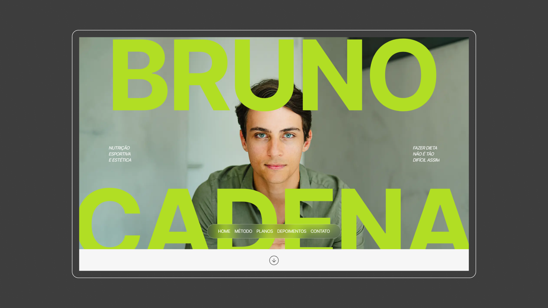
How do you take a personality-driven social presence and translate it into a landing page without flattening the personality?Most expert landings land on one of two failure modes: too clinical (white coats, calorie tables, jargon that protects the expertise instead of sharing it), or too generic (stock images, "your transformation starts here", no sense of why this professional rather than any other). Bruno needed neither. The voice that earned him 9K followers, conversational, practical, lived-in, had to carry over. But the page also had to feel serious enough for someone landing for the first time to trust it.And the format made it harder. A landing page (not a full website) means one screen has to do all the work of positioning, proof, and conversion at once. Anything that didn't earn its place visibly hurt the whole.

Solution

We organized the page around Bruno's central insight, "Fazer dieta não é tão difícil assim," and let every other section serve it.The visual register is clean and conversational, closer to a thoughtful editorial than a clinical brochure. Direct, second-person copy keeps the page feeling like the same conversation his audience already knows from his content, not a service catalog. The structure moves a first-time visitor from the headline insight through proof points (specialization, approach, who it's for) and into a single, frictionless conversion path that mirrors how he already books: a direct line to talk to him.The result is a landing that does the job most expert-led pages don't: it makes the expert feel like the same person his existing audience already trusts.

Credits

Product Owner: Ícaro de Souza
Research & Strategy: Ícaro de Souza, Arthur Galvão
Development Direction & Management: Ícaro de Souza, Lucas Lavor
UI/UX Design: Ícaro de Souza, Arthur Galvão
WordPress Development: Lucas Lavor, Ícaro de Souza

Want to see more work?

See all projects
Obliant
Branding
Website
Rebranding Sun Consultech into Obliant — naming, strategy, and a visual system built to scale across five consulting verticals with institutional authority.
Immersy
Branding
Naming and branding Immersy, a Brazilian English school built on real immersion — strategy, custom type, illustration, and a distinctive visual identity.
See all projects

Want to talk about a project?

From crafting unique brand identities to designing intuitive websites and valuable content, we're here to execute your ideas.
Contact us, and let's discuss your project.
Arthur Galvão
Co-founder & CBO
Let’s talk
Your Timezone (US)  20:26:24
Revelatio Timezone (BR) 20:26:24

Let’s build  
something together

Hello Osmo
By clicking “Accept”, you agree to the storing of cookies on your device to enhance site navigation, analyze site usage, and assist in our marketing efforts. View our Privacy Notice for more information.