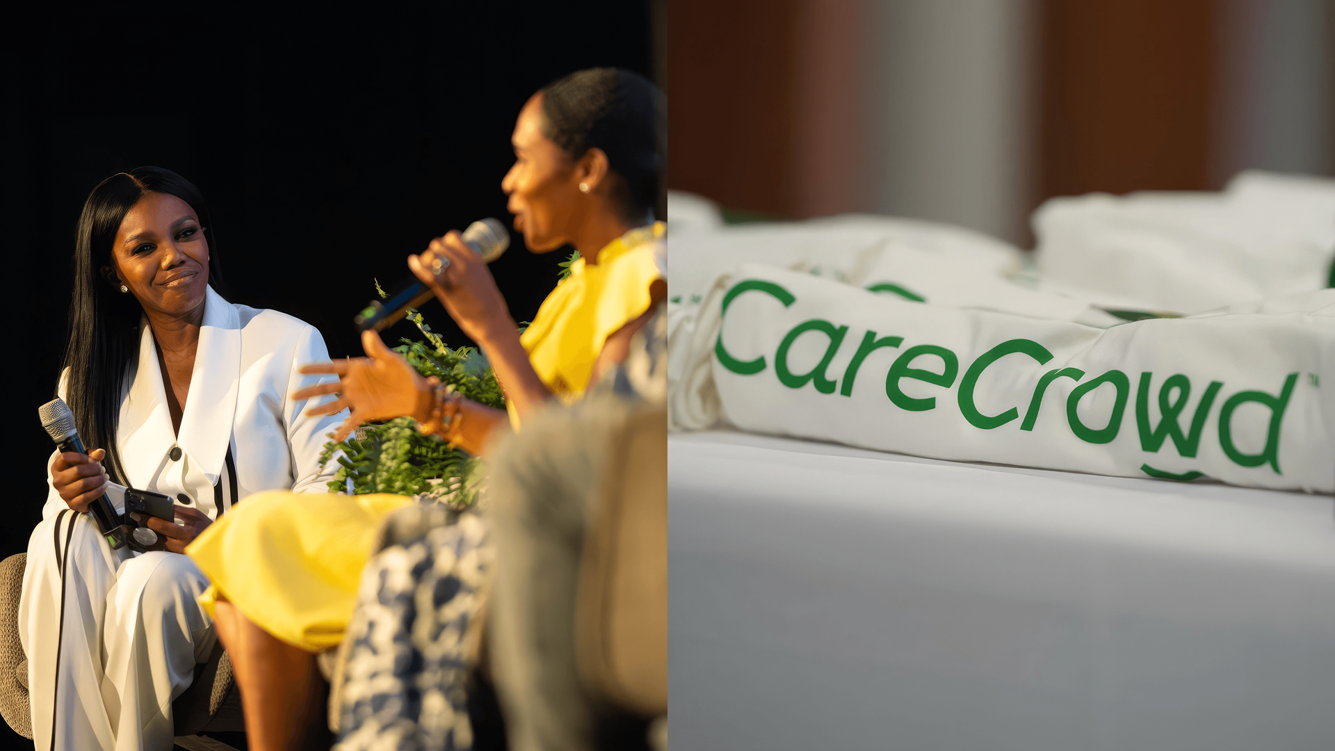
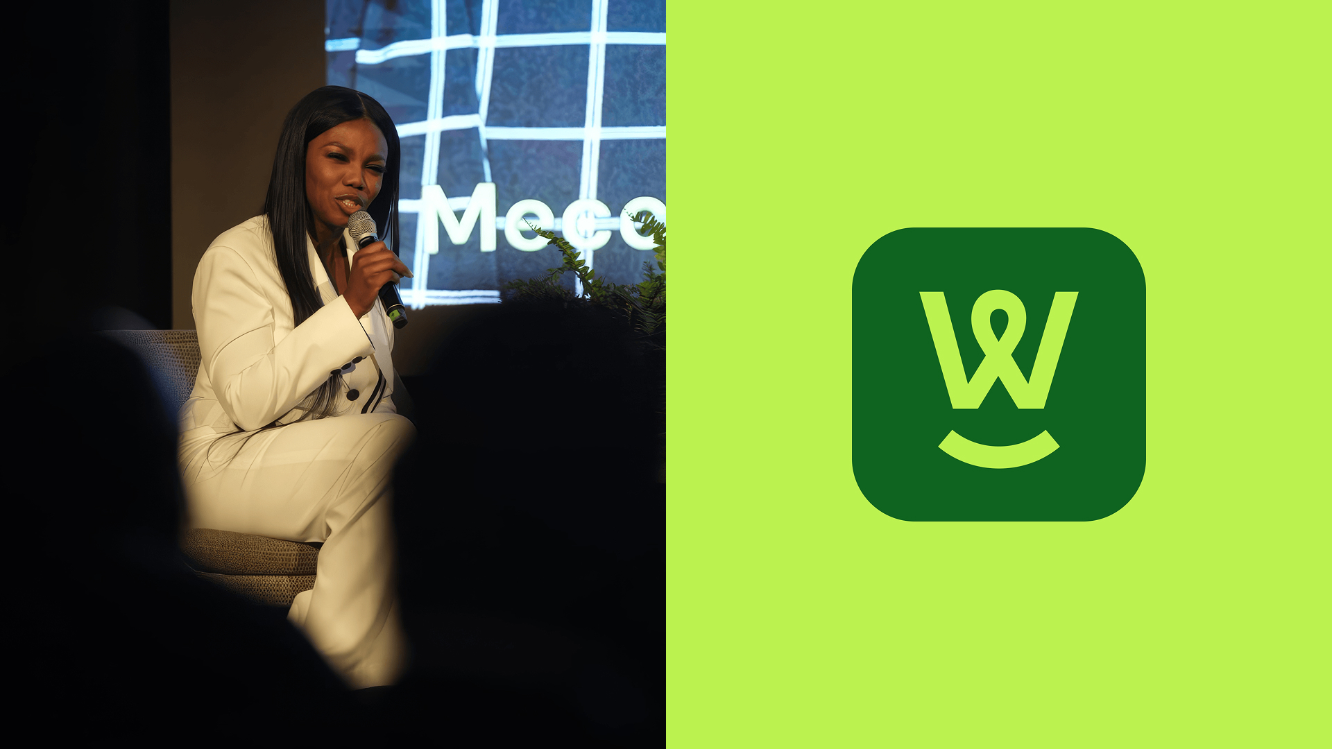
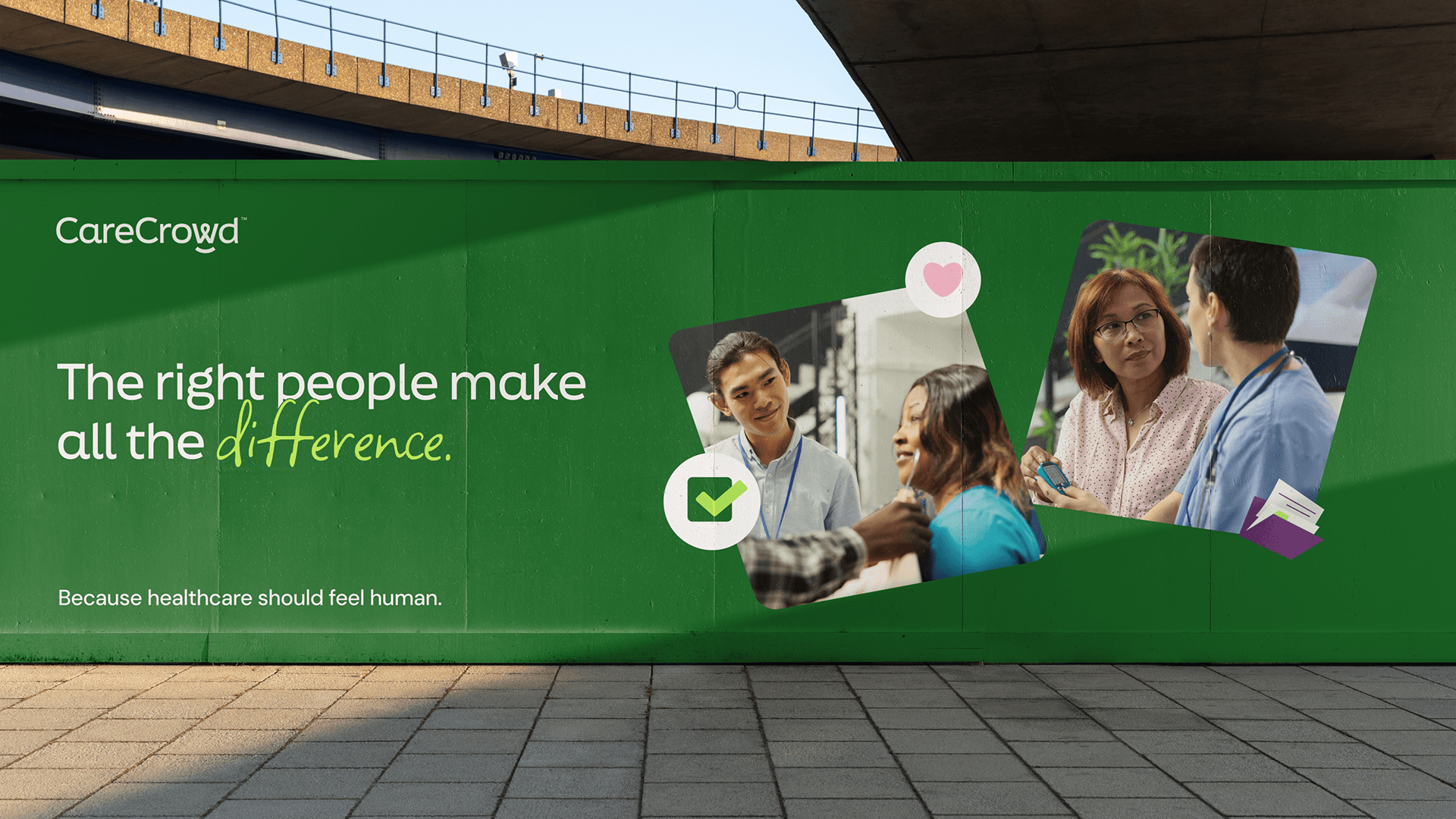
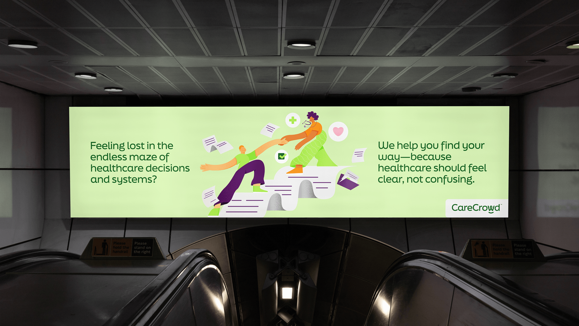
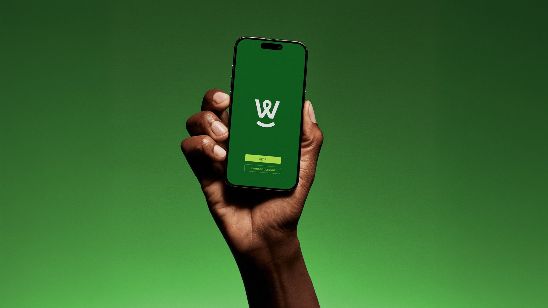
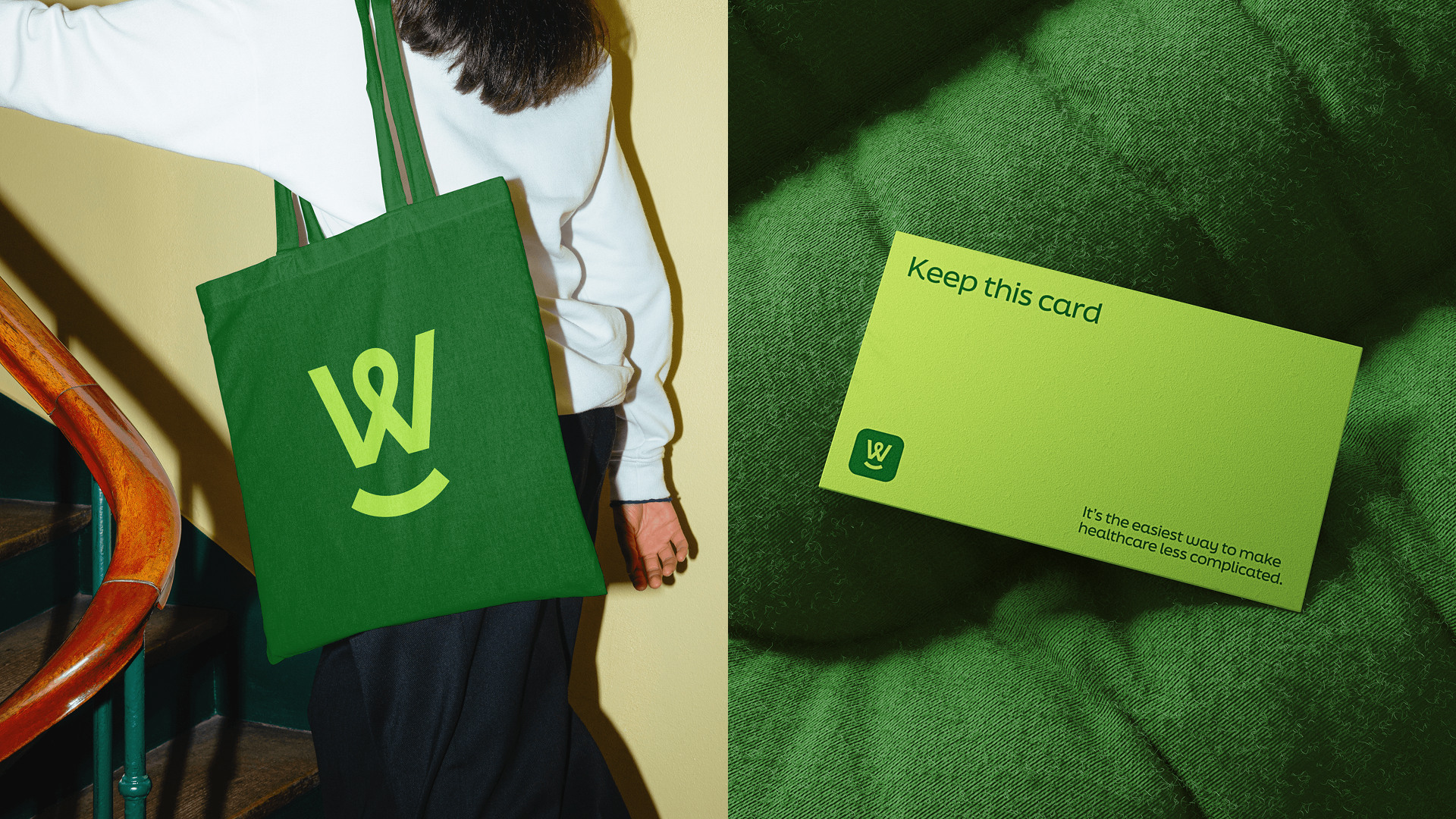
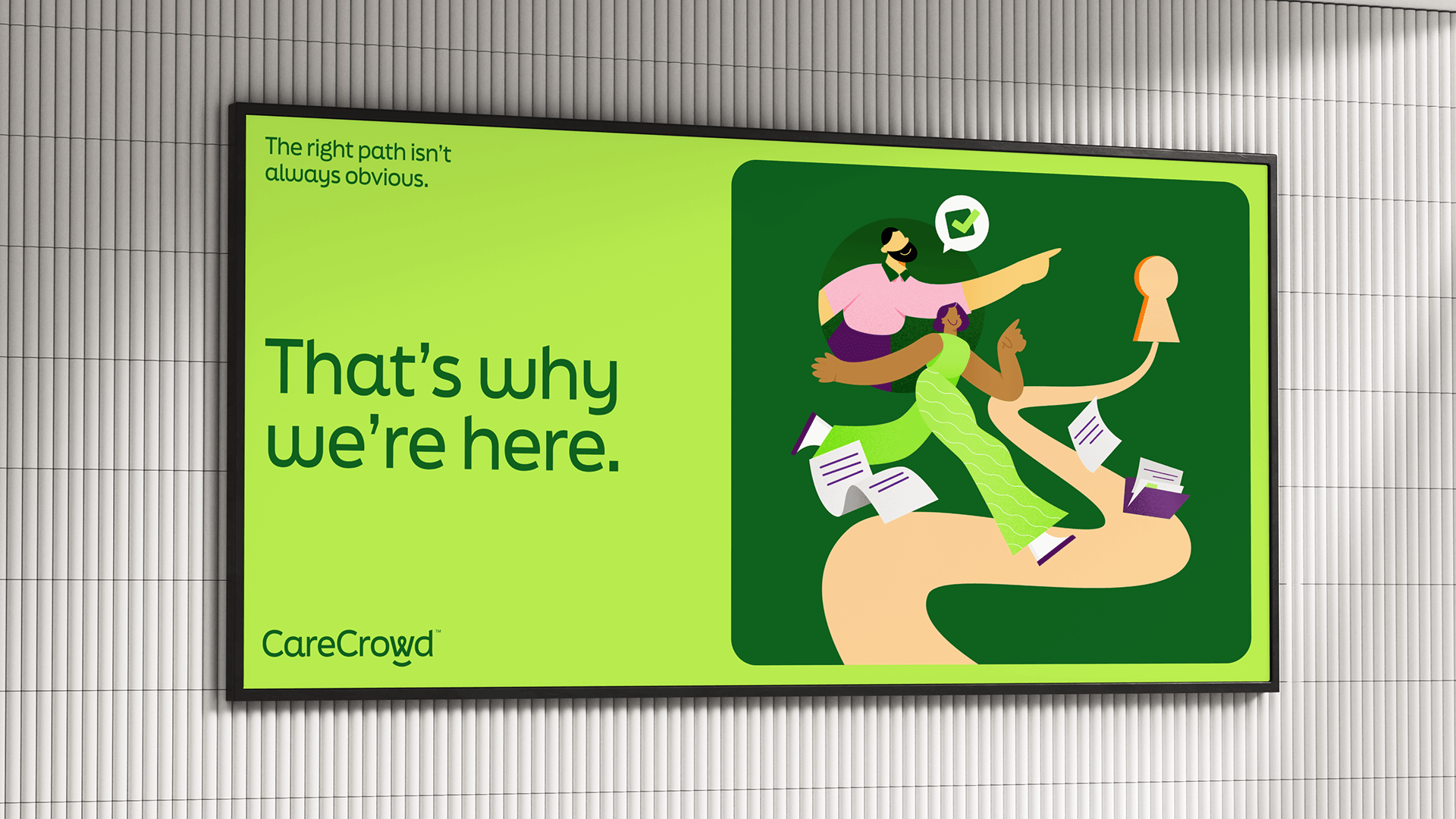
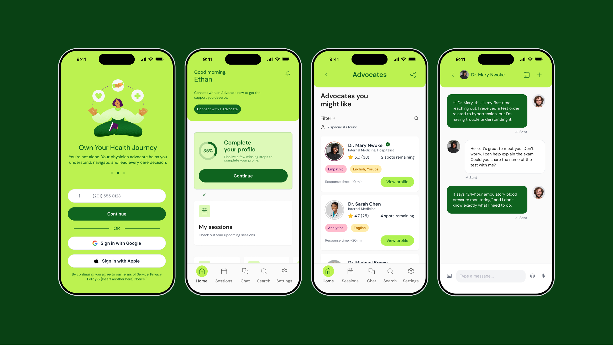
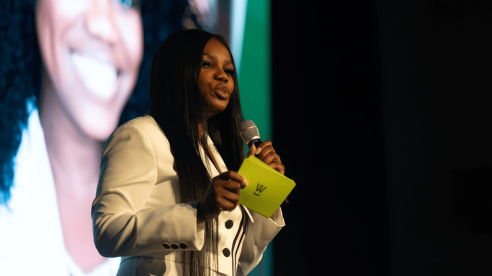
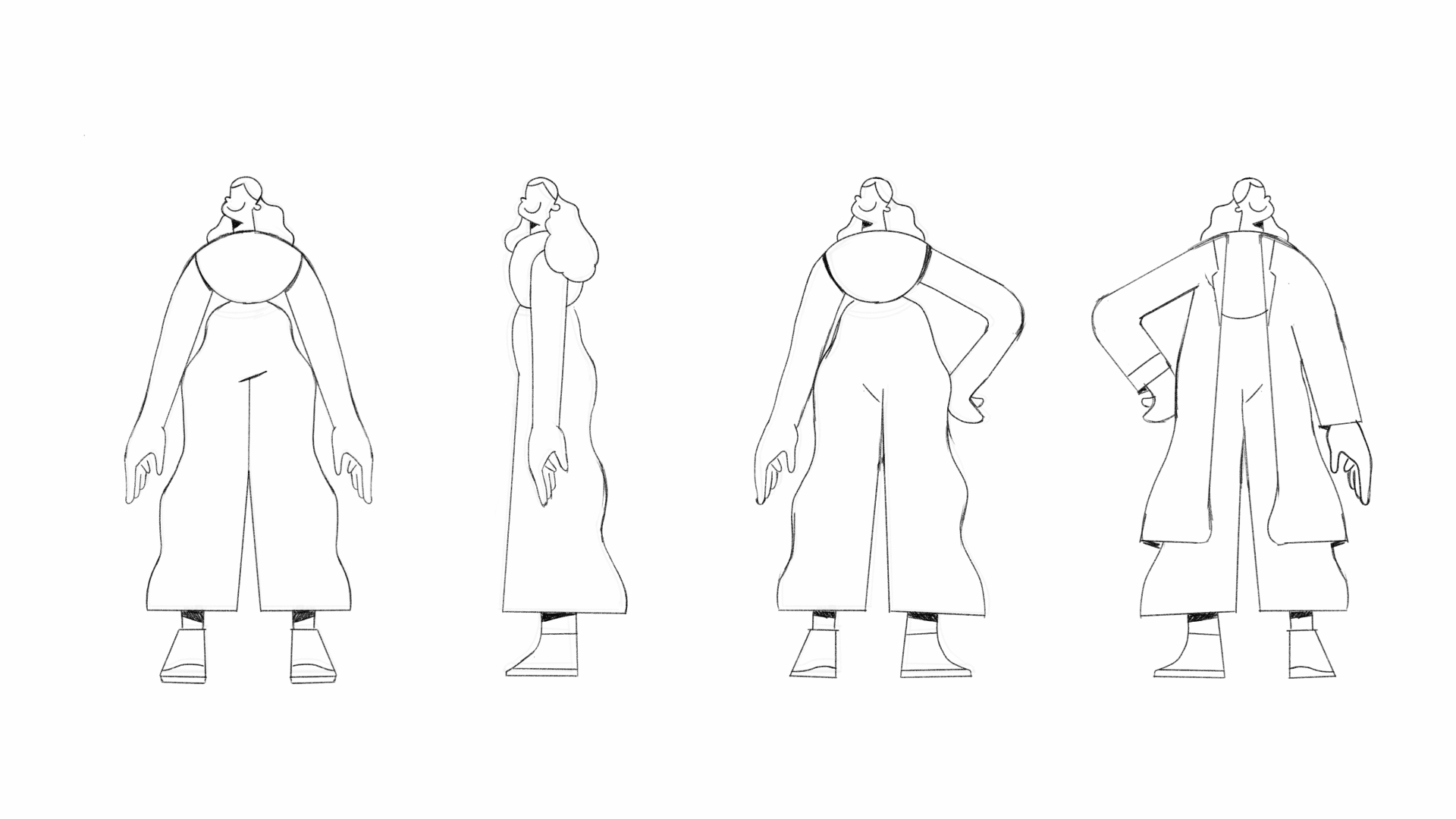
Construímos a marca em torno de uma única ideia organizadora: advocacia. A CareCrowd não apenas informa, ela acompanha. O posicionamento foi enquadrado em torno de cuidados proativos, empoderamento e a face humana da navegação na saúde. O logotipo reflete isso nos detalhes: um "W" personalizado que sutilmente forma tanto um aperto de mão quanto um sorriso, codificando conexão e segurança diretamente na marca. Uma paleta de cores quente e otimista estende essa energia por todos os pontos de contato. O sistema de ilustração, central para o impacto emocional da marca, foi cuidadosamente desenvolvido para humanizar a experiência em escala: personagens reais, emoções reais, situações reais, projetadas para educar sem intimidar. Juntos, o sistema verbal e visual fala como um ser humano, não como uma plataforma. E essa distinção é exatamente o ponto.

.png)