CareCrowd — Designing a human-first brand for a platform bringing empathy back to healthcare navigation.

Healthtech | 2025

Deliverables

Brand Strategy, Messaging, Visual Identity, Illustration, Product Design, Motion Graphics, Brand Guidelines & Brand Applications

Context

Healthcare in the US is structurally broken for the people navigating it. Not just clinically, but experientially: cold interfaces, fragmented information, and systems designed around processes rather than people. CareCrowd was founded to change that dynamic, bringing together intelligent technology and genuine human care to guide people through medical complexity with clarity and confidence. The mission was clear. What it needed was a brand that could carry it.

Challenge

Building a brand in healthcare means operating inside one of the most trust-sensitive categories in existence. People come to these touchpoints overwhelmed, sometimes frightened, often alone. The brand had to do something genuinely difficult: feel warm without being naïve, feel credible without being cold, and communicate complex processes without replicating the institutional friction it was trying to solve. Generic healthcare branding, all blues and abstract icons, wouldn't cut it. The brand needed a distinct emotional register, one that felt less like a system and more like a person standing next to you.

Solution

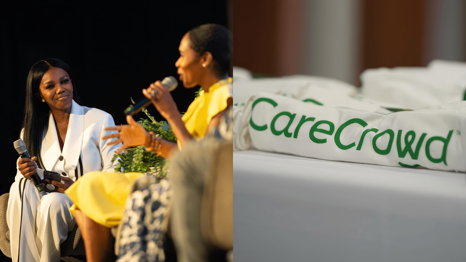
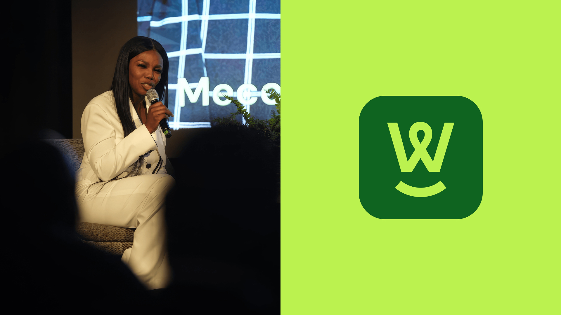
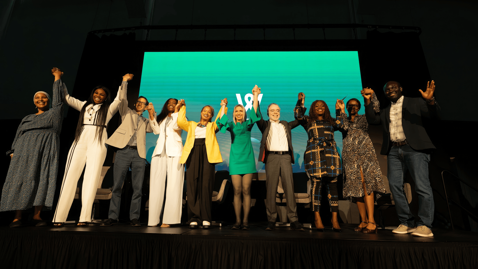
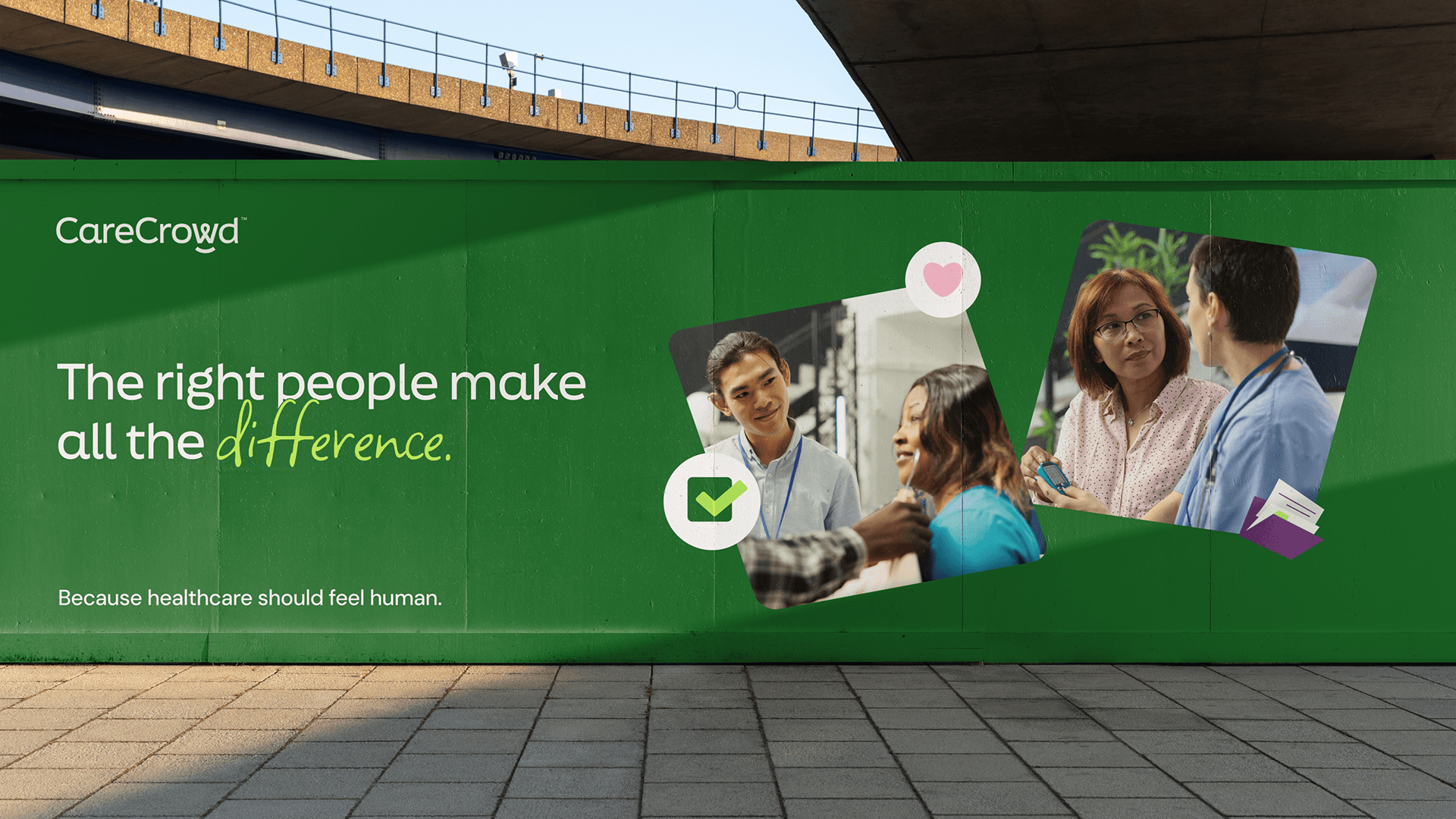
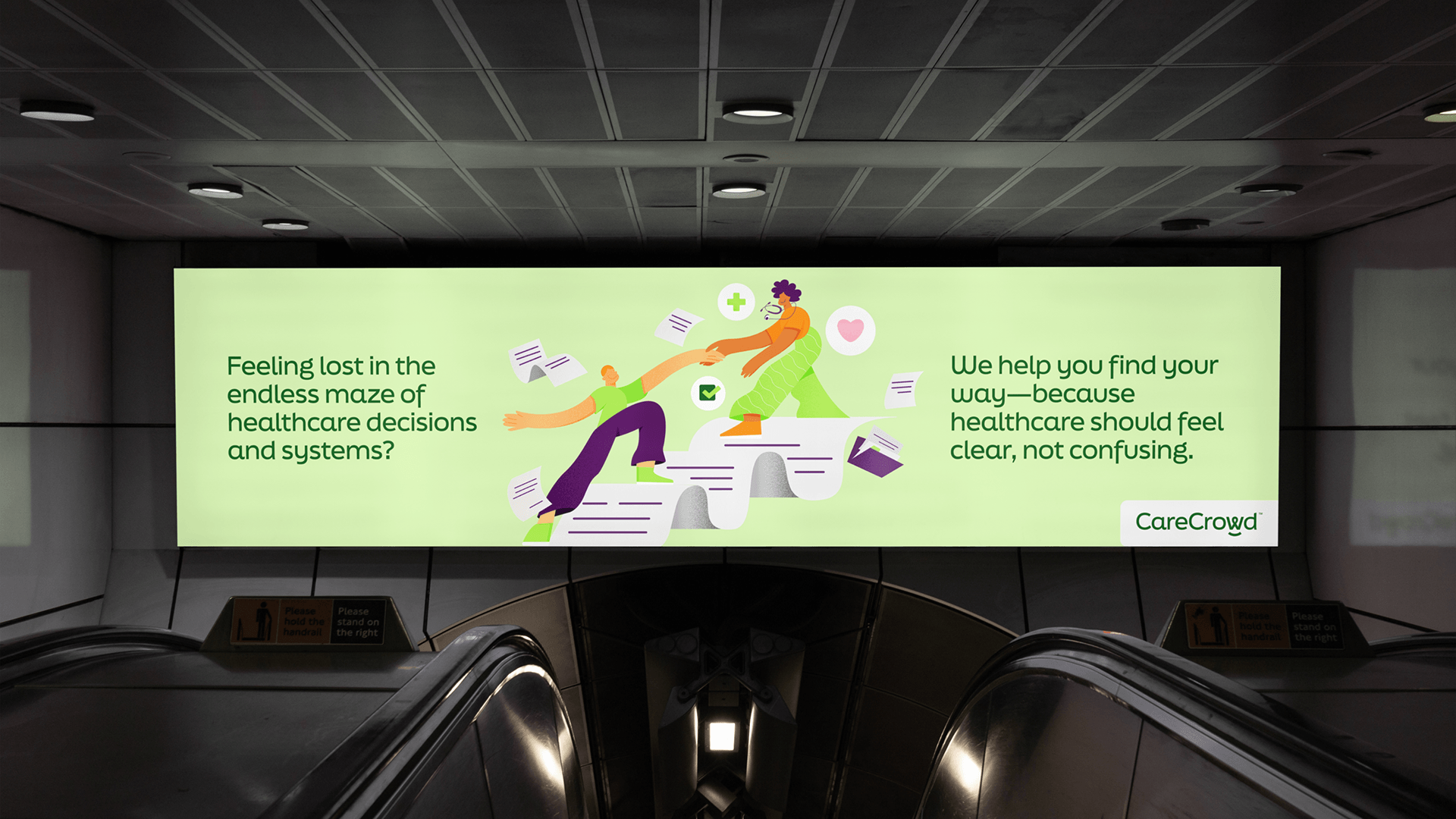
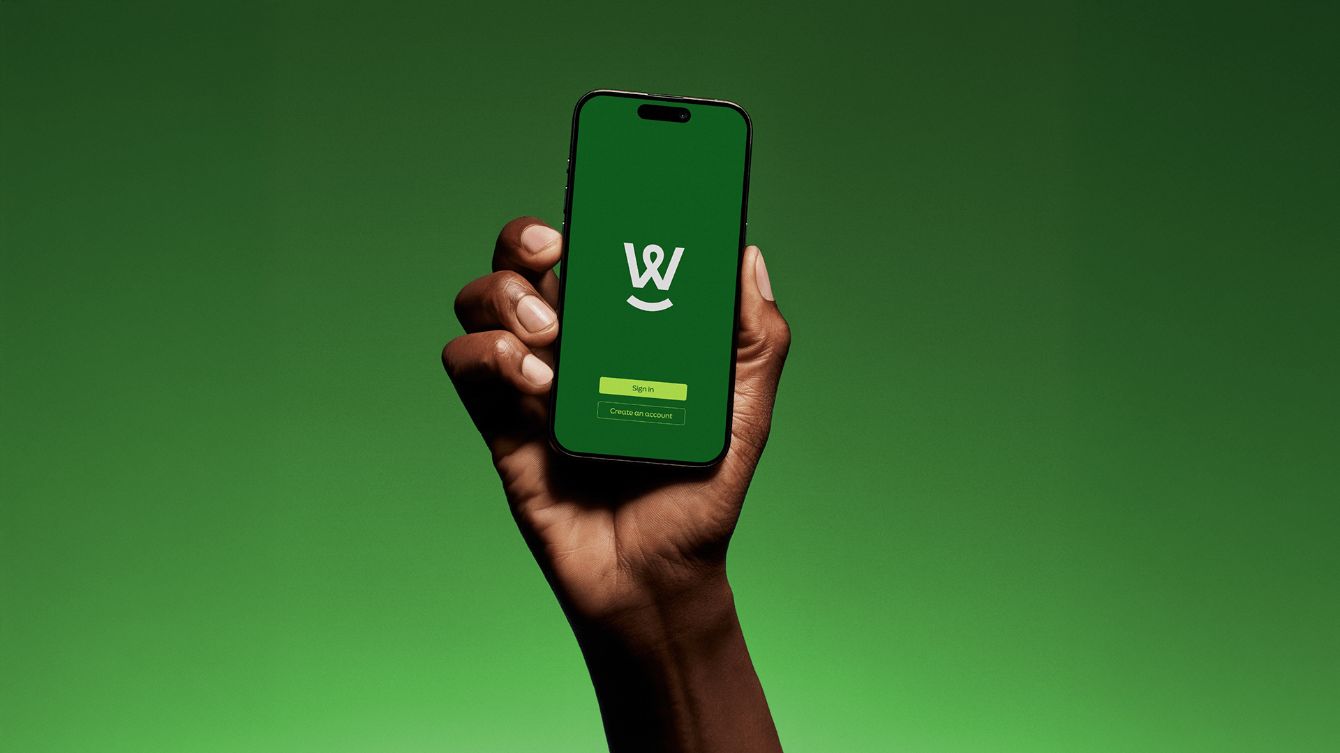
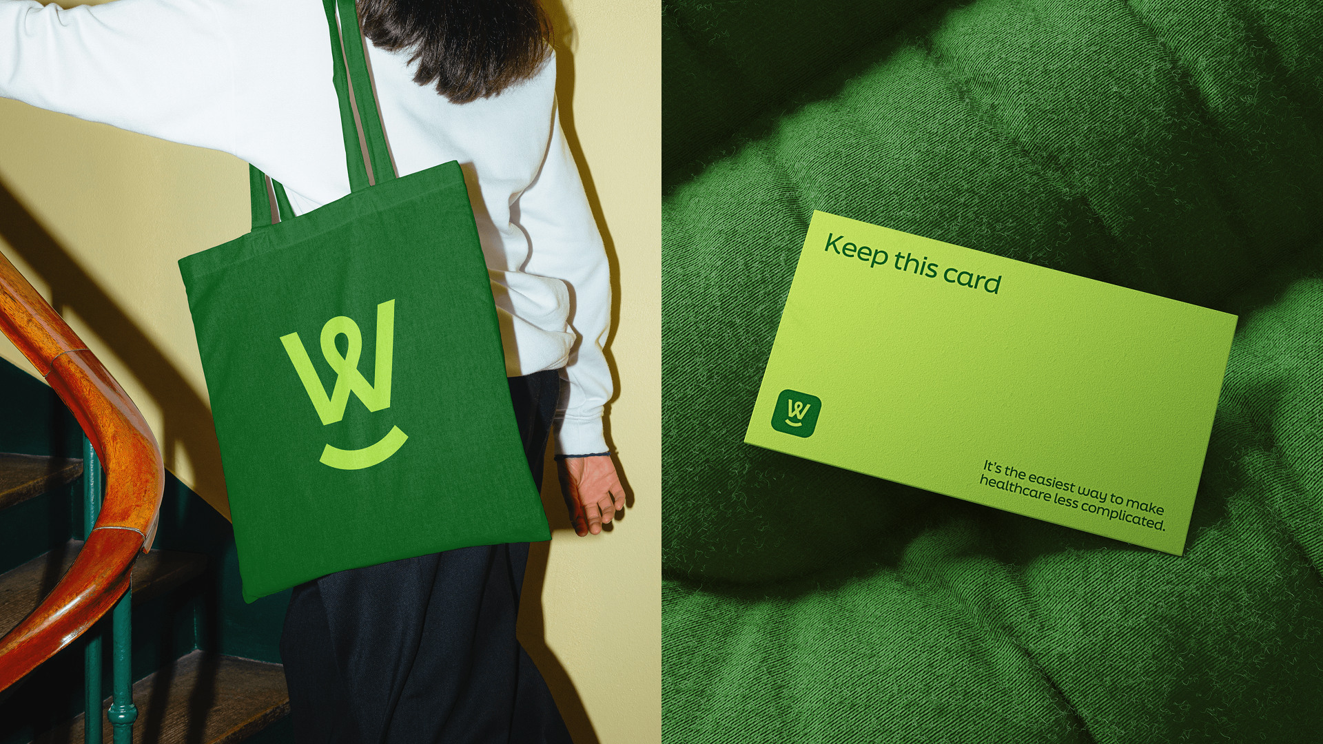
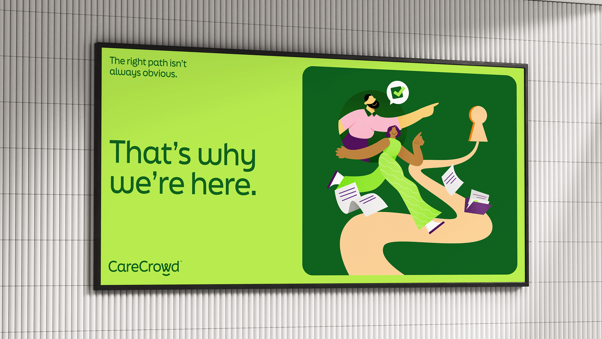
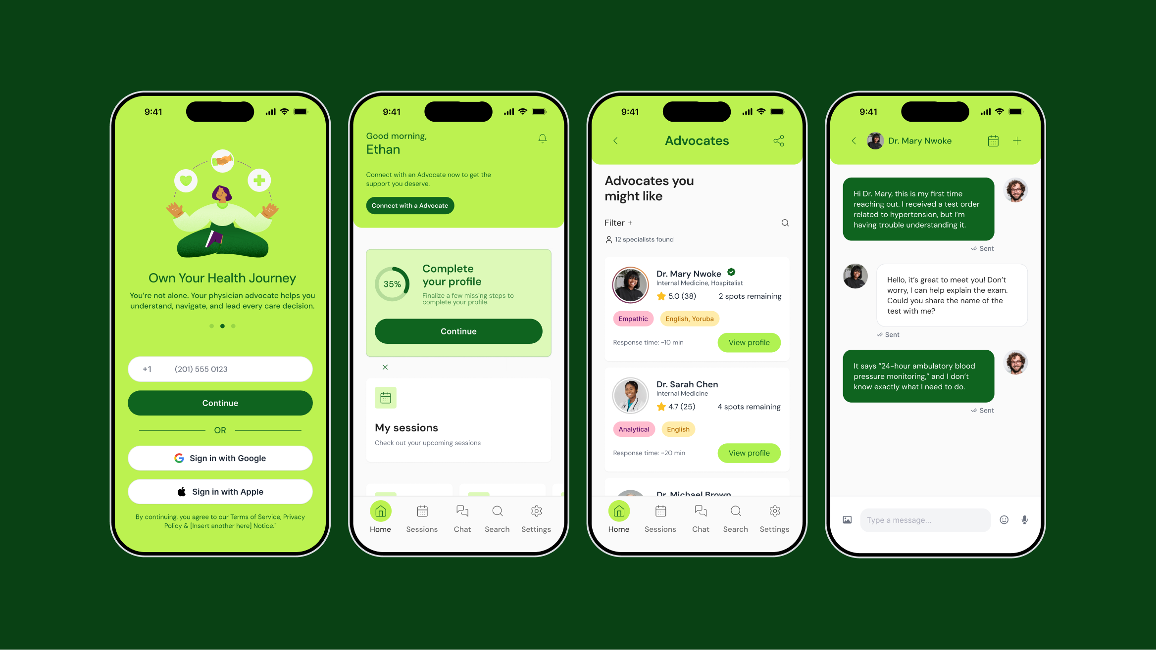
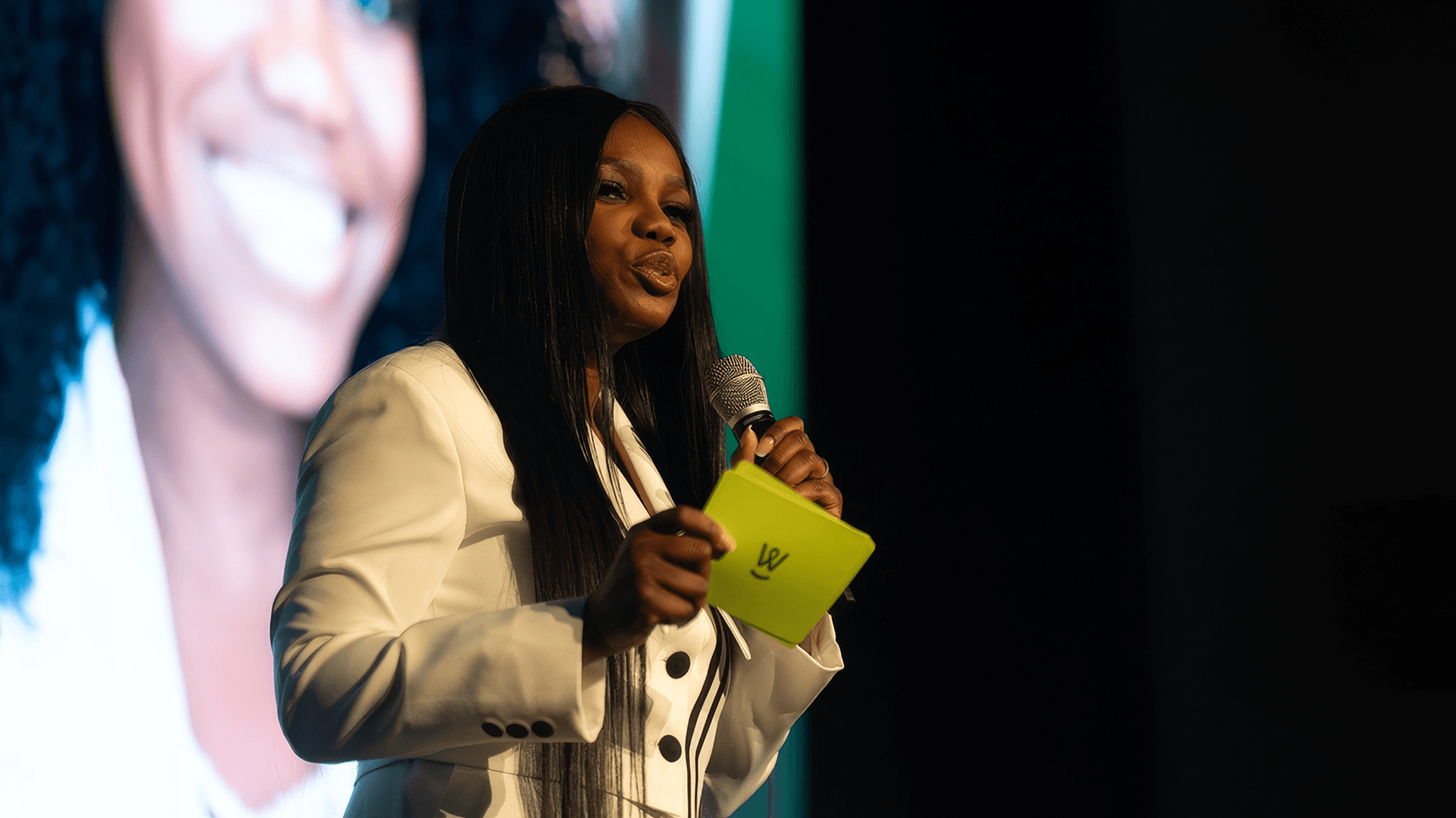
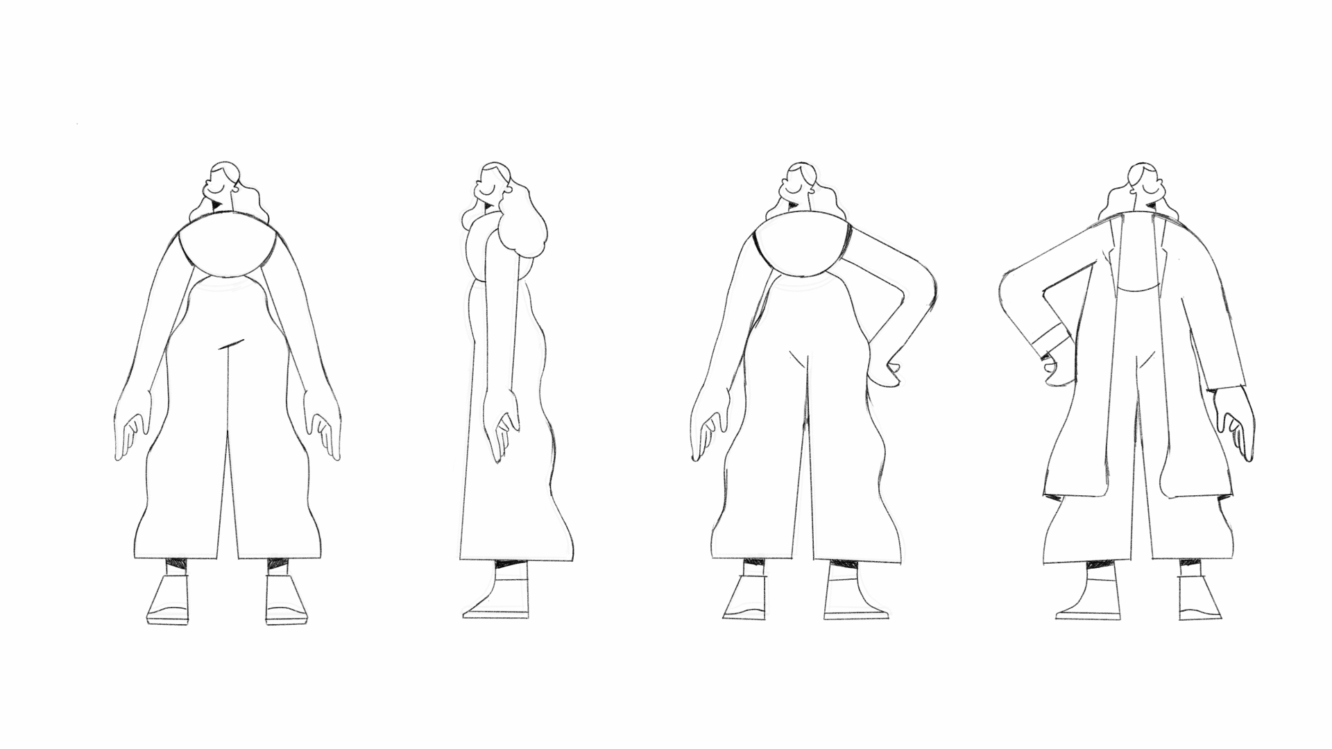
We built the brand around a single organizing idea: advocacy. CareCrowd doesn't just inform, it walks alongside. The positioning was framed around proactive care, empowerment, and the human face of healthcare navigation. The logotype carries this through in the detail: a custom "W" that subtly forms both a handshake and a smile, encoding connection and reassurance directly into the mark. A warm, optimistic color palette extends that energy across every touchpoint. The illustration system, central to the brand's emotional impact, was carefully developed to humanize the experience at scale: real characters, real emotions, real situations, designed to educate without intimidating. Together, the verbal and visual system speaks like a human, not a platform. And that distinction is exactly the point.

Credits

Creative Direction: Arthur Galvão
Research & Strategy: Arthur Galvão
Messaging: Arthur Galvão
Brand Design: Arthur Galvão
Illustrations: Luan Leite
Motion Graphics: Eliseu Junior
Case Study: Arthur Galvão

Want to see more work?

See all projects
Prop
Branding
Bold branding for Prop, a market intelligence platform bridging scientific discovery and business — naming, strategy, and a future-facing visual identity.
Medno
Branding
Website
Brand and digital experience for Medno, turning corporate health from a black box into a managed function — strategy, identity, motion, and web design.
See all projects

Want to talk about a project?

From crafting unique brand identities to designing intuitive websites and valuable content, we're here to execute your ideas.
Contact us, and let's discuss your project.
Arthur Galvão
Co-founder & CBO
Let’s talk
Your Timezone (US)  20:26:24
Revelatio Timezone (BR) 20:26:24

Let’s build  
something together

Hello Osmo
By clicking “Accept”, you agree to the storing of cookies on your device to enhance site navigation, analyze site usage, and assist in our marketing efforts. View our Privacy Notice for more information.