Immersy — Naming and building a brand for an English school rooted in the philosophy of genuine immersion.

Education | 2024
Deliverables

Brand Workshop, Brand Naming, Brand Strategy, Positioning & Messaging, Visual Identity, Illustrations, Motion Graphics, Brand Guidelines & Brand Applications

Context

Giovanna started as a freelance English teacher with a clear pedagogical conviction: real language learning doesn't come from repetition and memorization, it comes from genuine immersion. Her approach worked, demand grew, and she found herself at a turning point. The personal reputation she had built was real, but it was tied entirely to her as an individual. To grow sustainably and reach a broader market, she needed to transform what she'd built into something larger than herself: a brand with its own identity, presence, and vision.

Challenge

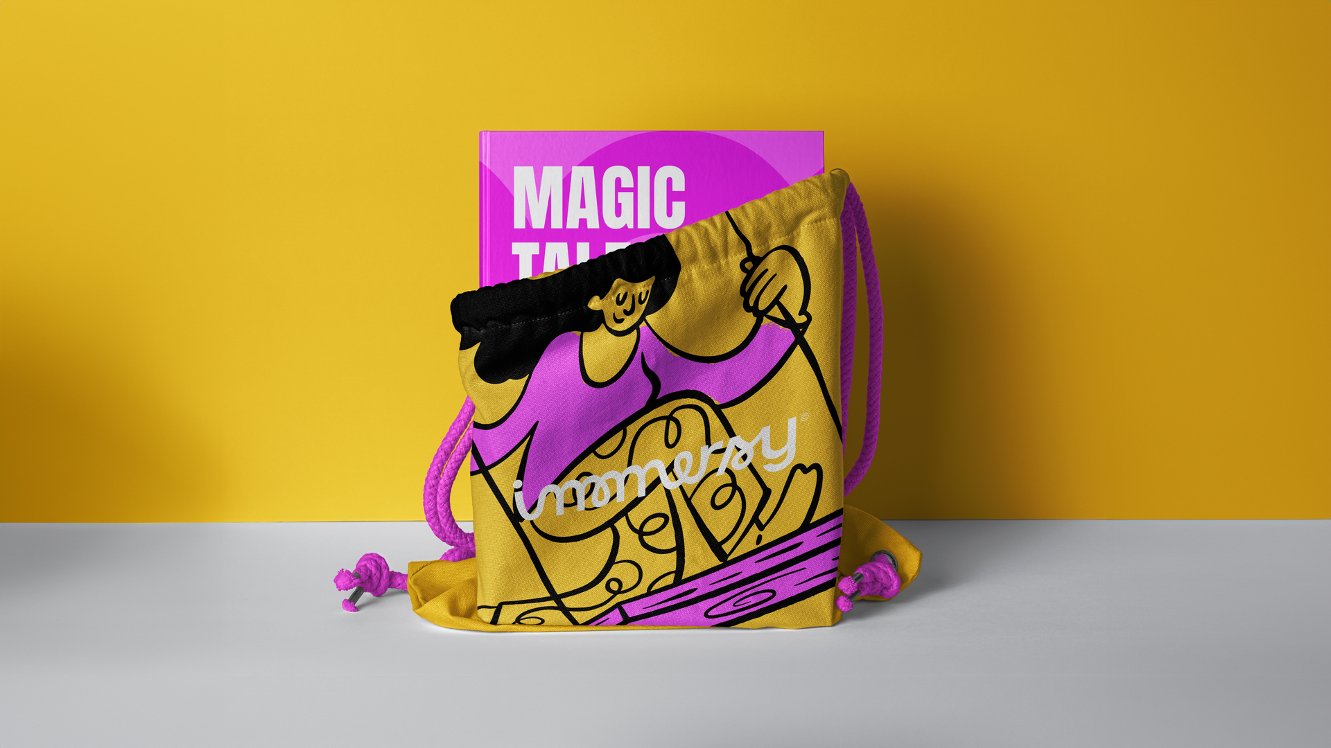
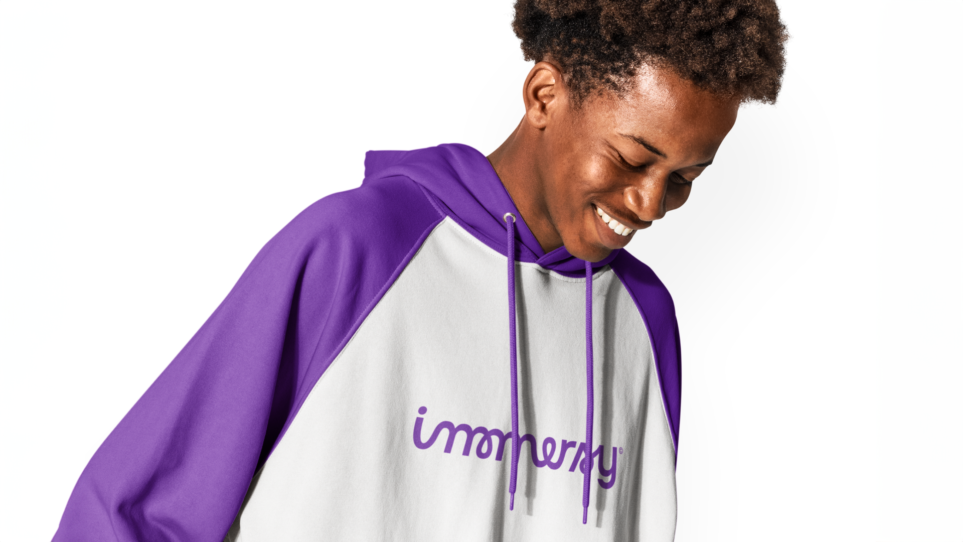
The English education market in Brazil is crowded and, for the most part, visually and conceptually undifferentiated. Most schools compete on price, convenience, or credential stacking, rarely on the quality or philosophy of the learning experience itself. Immersy's model, teachers visiting students at home, individually or in groups, was genuinely different. The challenge was to build a brand that made that difference legible and memorable, while also transitioning Giovanna from a freelancer with loyal clients into a founder with a scalable operation. Everything had to be built from scratch: name, strategy, verbal identity, visual language, and the connective tissue between all of them.

Solution

We started with strategy, running workshops with Giovanna to define the brand's foundations: its purpose, personality, archetype, audience, and tone of voice. The naming came directly from the school's core idea. "Immersion" became Immersy, a name that carries the philosophy inside it while feeling modern, friendly, and easy to remember. The "y" ending adds a lightness that keeps it from feeling academic or institutional. The visual identity followed the same logic: custom typography built around a fluid, distinctive "m" that reinforces the brand's character, a vibrant color palette that signals energy and curiosity without falling into the generic palette of edtech, and an illustration system that adds warmth and narrative presence across every touchpoint. The result is a brand that feels as thoughtful as the teaching method behind it, and distinct enough to grow well beyond its founder.

Credits

Creative Direction: Arthur Galvão
Research, Strategy & Verbal Identity: Arthur Galvão
Brand Naming: Arthur Galvão & Mateus Ritter
Brand Design: Arthur Galvão & Thiago Ildefonso
Illustrations: Pablo Stanley & Luana Miotelli
Motion Graphics: Klayton Fadul
Case Study Finalist: Xico Libório

Want to see more work?

See all projects
CarbonTag
Product
Code
CarbonTag, a science-backed platform that lets London's small food producers measure the cradle-to-grave carbon footprint of every product in a few clicks.
CareCrowd
Branding
Product
A human-first brand for CareCrowd, the healthtech platform bringing empathy back to US healthcare navigation — strategy, identity, illustration, and motion.
See all projects

Want to talk about a project?

From crafting unique brand identities to designing intuitive websites and valuable content, we're here to execute your ideas.
Contact us, and let's discuss your project.
Arthur Galvão
Co-founder & CBO
Let’s talk
Your Timezone (US)  20:26:24
Revelatio Timezone (BR) 20:26:24

Let’s build  
something together

Hello Osmo
By clicking “Accept”, you agree to the storing of cookies on your device to enhance site navigation, analyze site usage, and assist in our marketing efforts. View our Privacy Notice for more information.