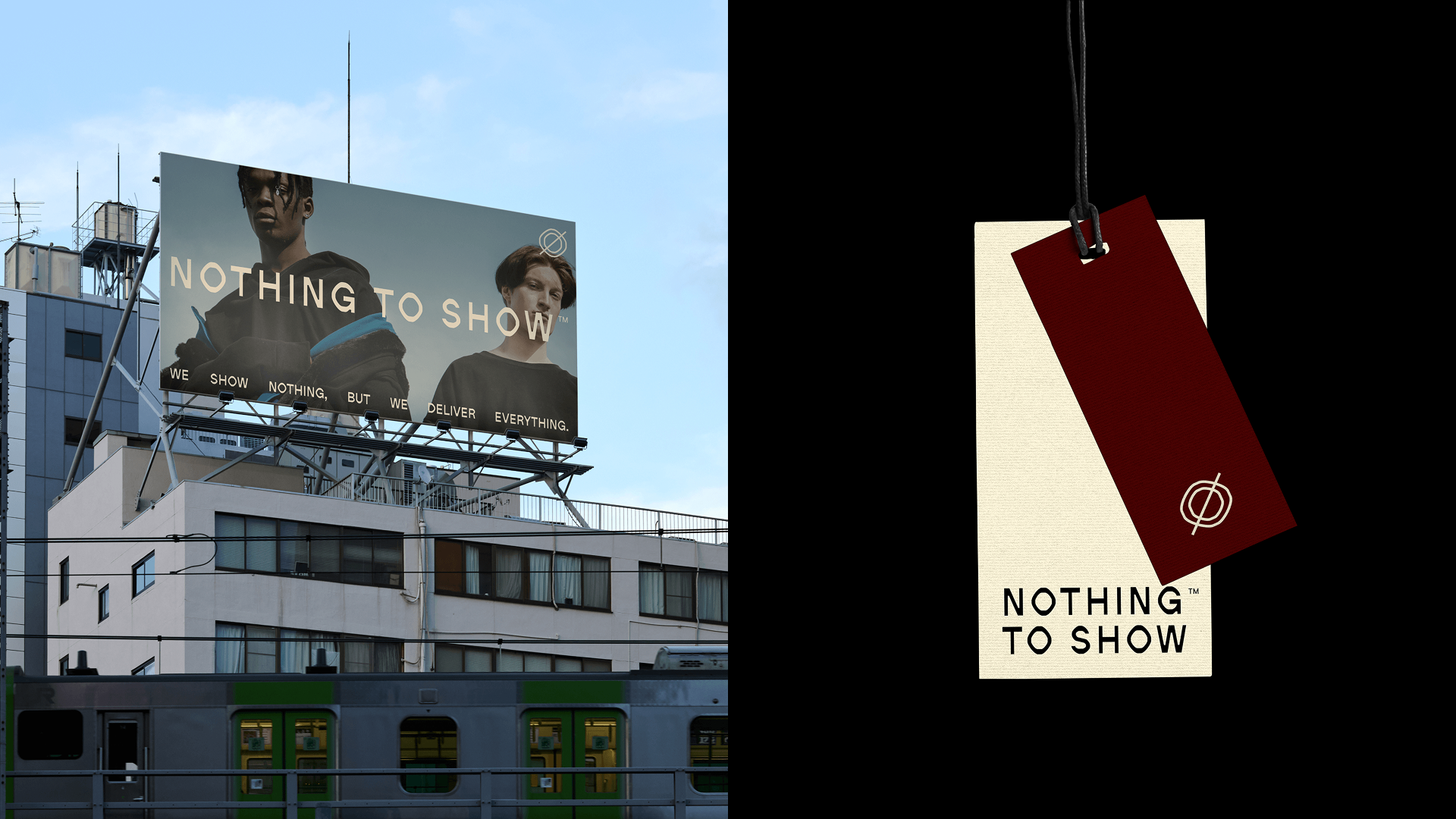
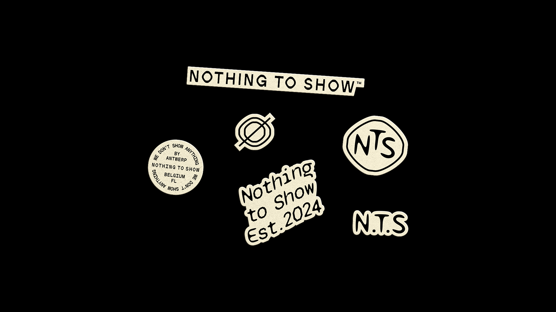
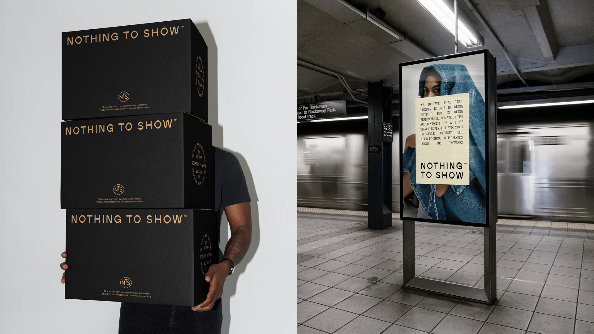
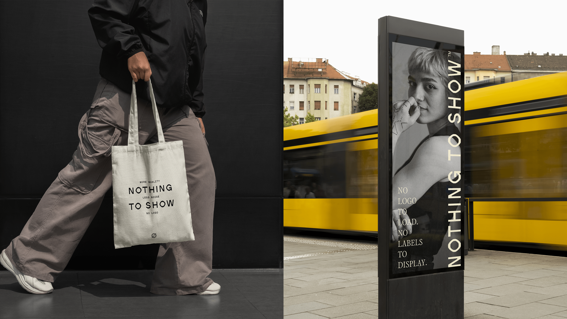
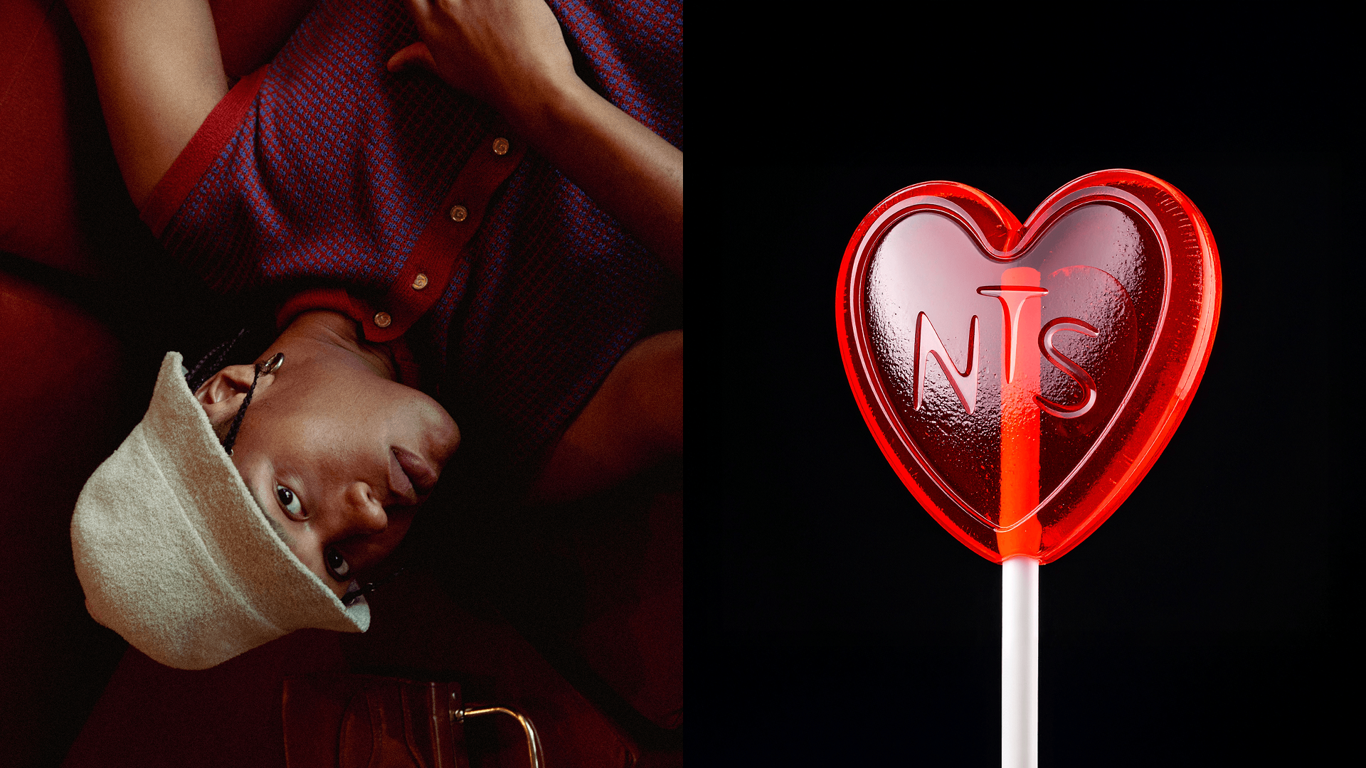
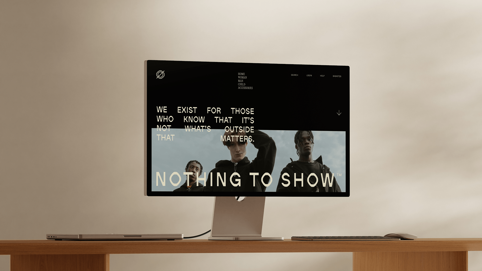
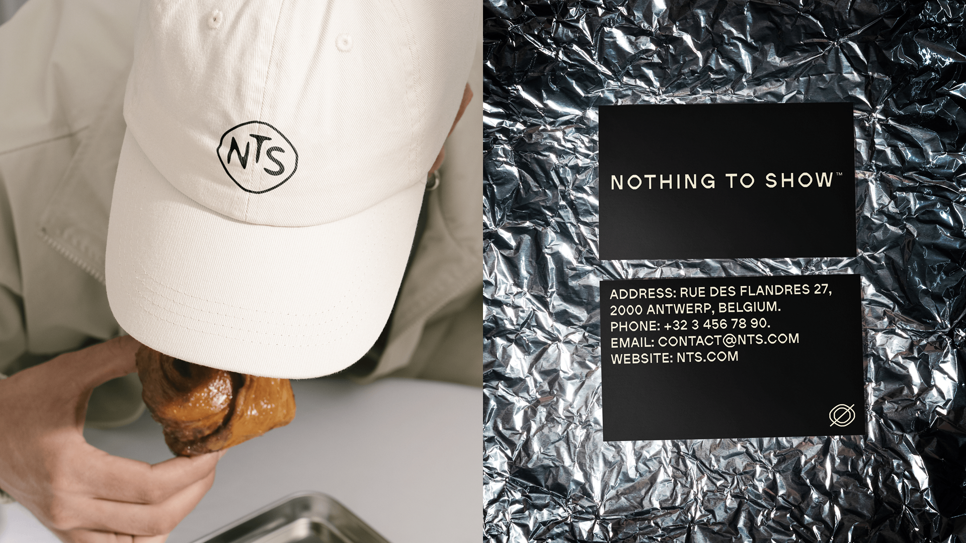
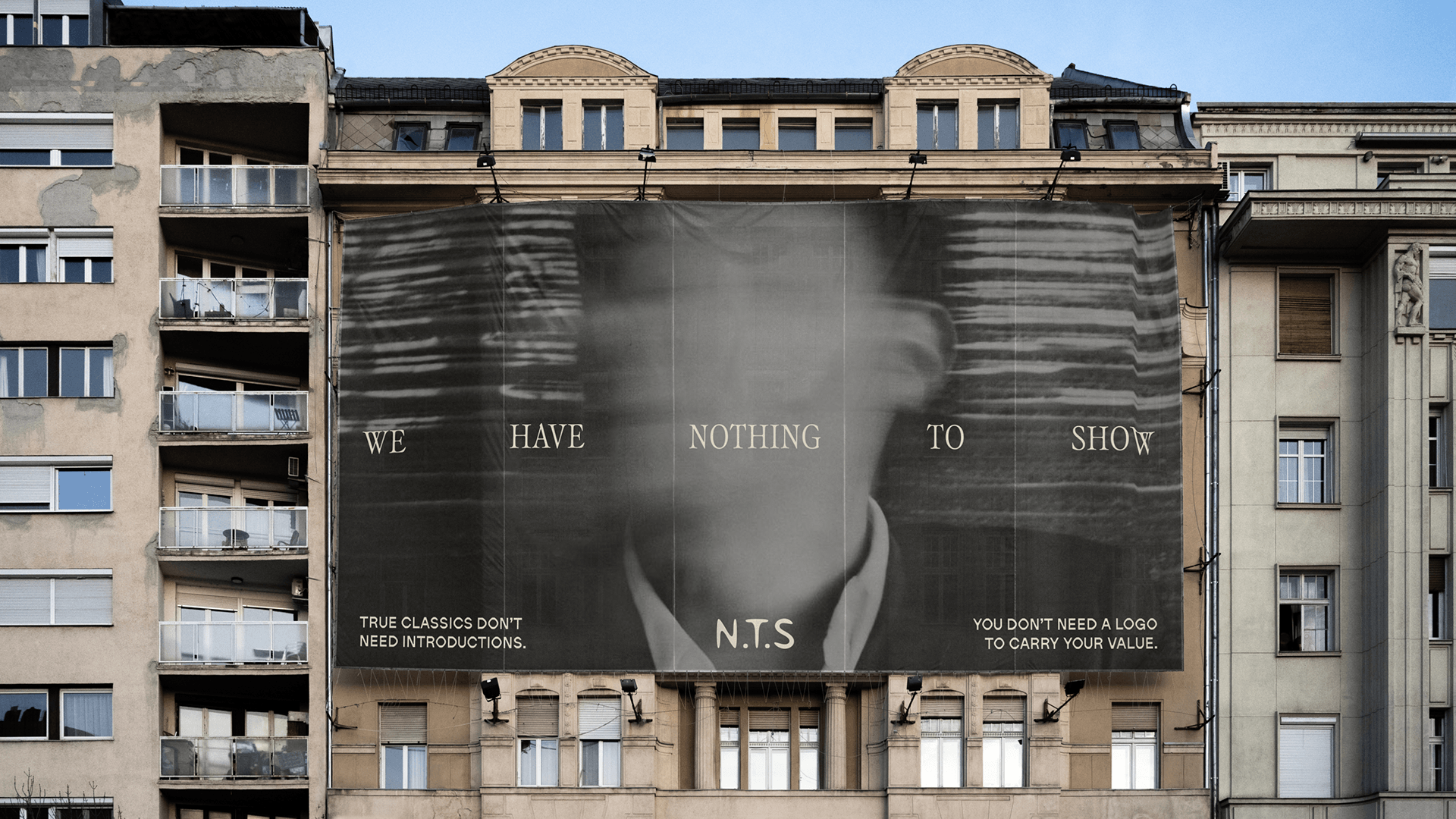
We leaned into the paradox. The name itself, Nothing to Show, became the positioning: a provocation and a promise at once. The verbal identity was built around restraint and precision, communicating sophistication without performance, conviction without noise. Visually, the system is quiet and intentional: a palette of Bordeaux, Black, and Off-White; structured typography with just enough personality to hold weight; a logotype used sparingly, as a statement rather than decoration. Every application is product-first. The identity exists to frame the work, not to compete with it. The result is a brand that steps back so the pieces can speak louder than the name behind them.


.png)